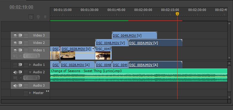
Today I have been editing more of my final sequence. The main focus of today's lesson was working with the outfit change shots of Erin and playing around with different effects to see how they could best be fitted into my sequence. Originally I had shot the footage in portrait mode so that all of Erin's body could be seen in the shot. However I came across an issue when putting this into my sequence as it was rotated the opposite way round to all of my other footage so it didn't fit into the sequence correctly. I decided to make the decision to rotate the shots round by 90 degrees and chose to only use the top half of the shots as not all of the shot would now fit into the frame. As this would create a dramatic difference within shots going from before the outfit changes to after them, I decided to experiment with layering the shots. I put different shots on different video tracks and placed them over one another so that two shots would show up next to each other at the same time. As one shot ended the next shot would then show up next to the old one and so on. This gave a snappier effect to the shots and sped up the tempo rhythm of the piece whilst still fitting appropriately with the backing track. Overall, although I lost part of each shot I believe that the outcome from this edit- which I hadn't before considered- adds an effective atmosphere to the sequence and has taught me new techniques for editing footage. The screenshots below show part of my process.


Lots of comments below - it's okay, but you have a lot of editing to do to get it to work as well as it could. Initial thoughts:
ReplyDelete1. I think you hold the opening shot too long to get the bottle with the Mr Mudd logo on; you should probably cut between them
2. You will need to create a "Mr Mudd" studio ident to go after your Fox distriubtor logo
3. You've got some major focus issues going on...
4. I like the "single shot" idea, but if it's going to work, it needs to be a lot more smooth...
5. Not sure about the cross dissolve at 00:47; I would use a straight cut
6. Not sure what the shot of picking up the wine glass adds. It seems to me that you should cut from the glass to the bottle to the chair (removing the movement) to the bag
7. Again, not keen on the fade at 01:04 - should be a cut
8. The move at 01:12 is weird, although in itself it's quite good, but it would be better if the move ended with the "edited by" credit. The move is made redundant by the edit (and by the fade; again, should be a straight cut)
9. It's hard to see the costume designer credit; you may need to change the contrast?
10. Could possibly hol on the editor credit a little longer (we can frame-hold this)
11. I'm not sure about the shot which ends at about 01:34 - seems to be quite out of focus
12. The two shots with "Production design" and "DoP" seem to be held for a lot longer than they need to be; some more judicious editing would be good here (should be a lot snappier IMO) - that whole sequence needs some substantial editing (more a montage)
13. Lose the fade at 02:21
14. Again, we need to hold longeron the Exec Producer credit
15. The director credit needs to be edited to lose the out of focus bits
16. The V/O needs to come in later, after the director credit has gone. Also, the V/O is very distorted; you may need to re-record this?
17. I'm not sure about the long take of her walking down the stairs
18. Not keen on the crossfade at 03:13, or at 03:38; again, I think some judicious editing here would be sensible
Overall, this is okay - lower end L3, but you will need to do a lot of tidying up with the editing to get it higher, in order to lose some of the weaker shots and the long takes. Yoy might want to consider bringing the voice-over in earlier - not sure if this would work undescoring the credits - or starting with the V/O section and then doing a rewind effect to bring it back to the credits? That might be worth a go?
Some of the focusing issues can only be solved by editing, which means you lose some of the camera movement, but to be honest a lot of the shots are too long - generally, the camera-movement just isn't slick enough to justify the effect.
Do you have any more footage of Rosie walking down the street? I think this could do with a little expansion - more shots (you've not, for example, got anything further than an LS and you could do with using a wider range, if possible)