I have created a call sheet for my actors on the days of shooting. Precise shooting day will be decided by weather and availability of myself and actors.
Wednesday, 31 December 2014
Tuesday, 30 December 2014
Mood Board
Here is a link to the mood board that I have created on Pinterest that shows the elements and feel that I want me title sequence to create and have. I hope you enjoy!
Link to mood board: http://uk.pinterest.com/lauragreenley/as-media-studies-mood-board/
Link to mood board: http://uk.pinterest.com/lauragreenley/as-media-studies-mood-board/
Monday, 29 December 2014
Sunday, 28 December 2014
Location scouting
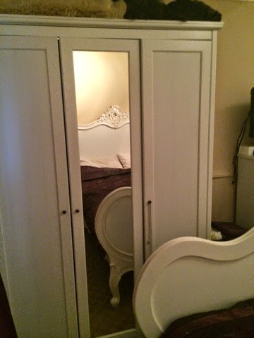
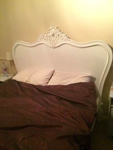
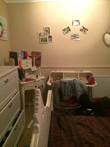
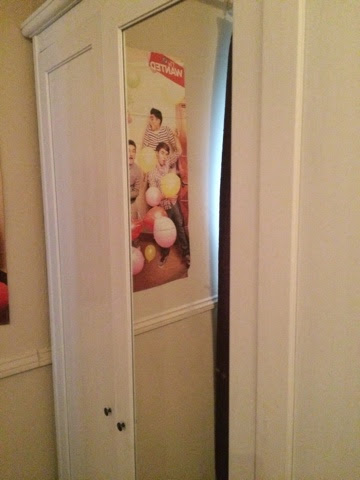
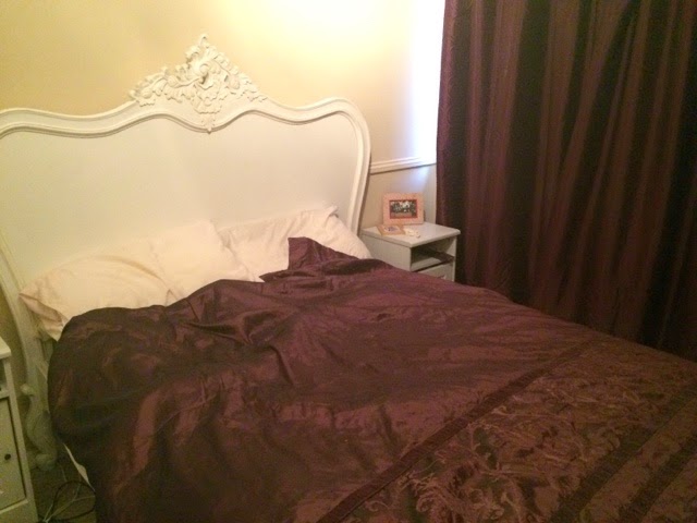
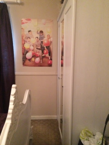
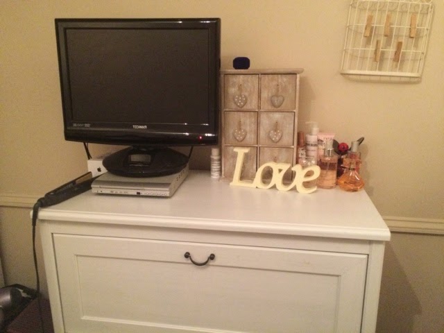
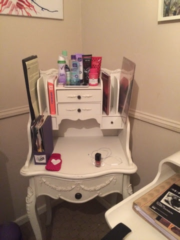
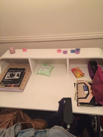
I have decided that I would like to shoot my opening title sequence in my own room. Being a teenage girl myself I feel that the area and space fit the requirements of my sequence and with a few added props here and there and adjustments to lighting and other features that this would be an ideal shooting location. To make this location really fit that the genre and feel of the film I aim to clutter up some of the walls and make the space look more lived in and less empty. I may try and use extra lamps or just general lighting equipment to try and make the room brighter so the image quality of each shot looks better. The definite key to getting this location to work with what I plan to do is the props. Once I have the props and I know how they're going to be used the rest of the location will fall perfectly into place and really fit in with my 'indie' teen comedy.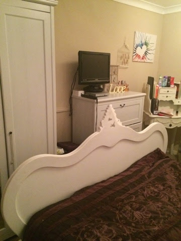

Saturday, 27 December 2014
Break down of titles
I have devised a list of the order of my titles for my sequence. By having this sorted at this stage in the process it means when it comes to editing my sequence the titles that aren't shot in the scenes will be easier and quick to insert. Here are the breakdown of my titles for my opening sequence:
- Fox Searchlight Pictures presents
- A Mr. Mudd Production
- Main Actor- Erin Convery
- Name of supporting actors (TBD)
- Film Title- Rosie
- Casting by Mary Vernieu
- Music by Sweet Thing
- Costume Designer- Ann Greenley
- Edited by Laura Greenley
- Production Design by Eve Stewart
- Director of Photography- Michael Gray
- Executive Producers Laura Greenley and Steven Spielburg
- Produced by Seth Rogen
- Directed by Laura Greenley
The Actors for my sequence are still to be decided and sorted out but this aims to be sorted as soon as possible so that I can look at call lists and production schedules.
Friday, 26 December 2014
Music
I've started to look at music for the soundtrack to my title sequence. Taking inspiration from Juno, I want the music I use to be in an indie pop kind of style. This sort of music works well for comedies as it is light hearted in tone and can be a mixture of beats and rthyms that could be used to nicely represent the mood swings that are commonly associated with teenagers.
Here I have a list of some of the tracks I have been looking at:
- The Naked and Famous- Young Blood https://www.youtube.com/watch?v=0YuSg4mts9E
- Strange Talk- Climbing Walls https://www.youtube.com/watch?v=KSbA_tm7Ntw&list=PLR9ZT0aW1y2nHP29FLpFBsiCGDxmeo2Tq&index=8
- Sarah Jaffe - Clementine https://www.youtube.com/watch?v=i3AtRBlRQ-I&index=1&list=PLqaFmC5jkGJF1PwDkyimJQFQnocvIP38R
- The Kooks- She moves in her own way https://www.youtube.com/watch?v=X0_dzob846E&list=PLA8182443AE2BD1D6&index=4&spfreload=1
- Mumm-ra- She's got you high https://www.youtube.com/watch?v=GKypqSL49Pg&list=PLE1A131E9DB7DA81A&index=5
- Lenka- The Show https://www.youtube.com/watch?v=uvkqFl_xLUs
Each track could easily fit the role within my sequence. They all have a beat that you could associate with a teen comedy and they all have an indie vibe that I'm looking to try and incorporate. However, the soundtrack the I aim to use on my title sequence is in fact is 'Changes of Season by Sweet Thing'.
( https://www.youtube.com/watch?v=3IHW21HbwXQ)
I really love the mood and vibe that this song gives off as it plays, it has a slightly heavier undertone in terms of its use of bass and guitar compared to some of the other tracks I have listened to but it has a bouncy quality that I feel is needed in a Comedy film.
The plan for this music is to be used as non-diegetic sound, as a backing track to the title sequence. If diegetic sounds such as dialogue do get used then I plan to fade the music in and out bu other than that there will be little or no editing done to the track as I feel it already fits in well with the scenario of my film so far.
Thursday, 25 December 2014
Wednesday, 24 December 2014
Genre, Representation, Audience and Institution
Genre
Comedy is a genre of film in which the main emphasis is on humor. These films are designed to entertain the audience through amusement, and most often work by exaggerating characteristics of real life for humorous effect. Films in this style traditionally have a happy ending (the black comedy being an exception). I choose to include this genre in my opening sequence as I feel that it is the most entertaining genre for the widest range of people and can be related to easily by all.
Comedy, unlike other film genres, puts much more focus on individual stars. While many comic films are lighthearted stories with no intent other than to amuse, others contain political or social commentary. There are a number of hybrid comedy genres, including action comedy, comedy horror, sci-fi comedy and military comedy. I plan to embrace this hybrid of comedy genre into my work as it will give the film more dimension and will have more opportunity to engage the audience.
With comedy there is no real social group as such as it relates to so many people. However, in my sequence I aim to focus the social group onto lead teen protagonist. By making teens the focal point of the film it gives my a clear focus for audience and representation, whilst still in keeping with my comedy genre.
Representation
My opening sequence will include one protagonist and a small minor role. The lead protagonist in my sequence will be a 17 year old girl and the representations will heavily focus on the stereotypes of young people. This girl will be heavily made up- as she is just about to go out- and will wear clothes that connote her promiscuous party lifestyle. I also want to bring in the stereotype of underage drinking and sex. This will be done by having contraceptives lying around in her room and showing shots of the girl drinking from an alcoholic beverage. Most, if not all of the representations for the teenager will be shown in the first scene with props and the composition of shots. I really want my protagonist to be heavily stereotyped so to show the audience just how ridiculously young people are portrayed throughout the media and also to use this as the source of my comedy.
The minor role will be played by an older person, the gender for this character does not matter as their role will be to play the 'fed up old neighbour' who lives across the street from the busy party. The age of this character, however, does matter. I aim to have this character be above the age of 40 and to have them represent the grumpy, middle aged lifestyle of the modern age. They will need to be short tempered and miserable in appearance so to connote their loss of youth and freedom.
Audience
In order to create an engaging and successful comedy title sequence I must first understand who my target audience is and what is too be expected from a film such as mine.
Target audience
The genre of my film will appeal to a wide range of people of various different ages. Comedy is a very diverse genre and unlike a horror or action film it can be adapted to suit all ages and personalities.
The target audience of a comedy film is very dependent on the content of the film. For example children’s films labelled as PG’s or U’s can have comical scenes in which would link it to the comedy genre the films would appeal to young children as well as parents as they are often family film, however the audience would be completely different for a comedy film labelled as a 12 or a 15, these films have the target audience of the certificated age given to the movie as the base, the movies are likely to appeal to people over the labelled age of film simply because comedy has a large target market appealing to larger proportion of the comedy theme market. The final age partition of the comedy target audience is 18 certificates, these film although still based around comedy are often more explicit in terms of language and scenes, making the film heavily aimed at the over 18s.
Certificate rating for my film
I would certificate rate my film at a 15. I have chosen to make it a 15 as I feel the elements of alcohol intake and possible language content would not be appropriate for a film that could be viewed by viewers younger than 12. This film would also not be explicit enough to need to fall under the 18 rated category as although there may be sexual references, there will be no explicit imagery or violence featured what so ever.
Institution
After my research into title sequences of Comedy films, I have decided that for my title sequence I shall be using fox searchlight pictures. Fox Searchlight Pictures, established in 1994, is an American film distribution company within the Fox Entertainment Group, a sister company of the larger Fox studio 20th Century Fox. It specializes in US distribution of independent and British films, alongside dramedy and horror as well as non-English-language films, and is sometimes also involved in the financing of these films.
I feel that this institution will fit in well with my sequence plan as my film will be both and independent and British film therefore this would be a very suitable institution to choose.
Tuesday, 23 December 2014
Plot outline
After finally deciding that the style for my opening title sequence would be based around Indie 'teen' comedy, I have begun to plan the outline for my plot. I want to take a lot of inspiration for my sequence from the 'Juno' and 'Napoleon Dynamite' sequences, focusing on one solo character and using realistic and easily available props. I really want to create an upbeat, bouncy mood from this sequence and to focus on the difficulties of teenage life, which can be turned into comedy. My aim in the opening sequence is to take the viewer back to their teen years that are supposedly the 'best years of your life' and focus strongly on stereotypes of young people to try to bring that element of comedy into my sequence.
I'm going to create a youthful tone in my opening by setting the first scene inside the bedroom of my main character (which I have not yet decided the gender of). In this scene I aim to use mise en scene to connote the age, gender and status of the character to the audience, for example, if the character was a girl, hair straighteners and make up may be included in some of the shots as images that are iconographic of a teenage girl. The character will be getting ready to go out to a party so this scene will show them preparing and getting ready. I would like to use this scene to show a wide range of my editing skills. I aim to use jump cuts to cut from close ups of props and perhaps try to create pieces of edits that invoke a party like atmosphere as the character listens to music. Also featuring as a prop in the room will be a bottle of alcohol, this will show the alternative representation of teens, showing them to be dependent on alcohol before they can legally drink. To create the effect of being 'tipsy' I will use some interesting edits to portray this to the audience. The second part of the title sequence will be the journey to and the arrival at the party. This is where I will use elements from the 'Juno' title sequence and 'The perks of being a wallflower' (POBAW) title sequence. The range of shots that are used throughout 'Juno' and the effective use of tracking shots used in 'POBAW' will be incorporated here and track the journey of the character, giving them mystery and meaning. The sequence will end with a medium close up, moving to a close up, of the main character as they mistakenly arrive at the wrong house for the party they are supposedly attending.
I'm going to create a youthful tone in my opening by setting the first scene inside the bedroom of my main character (which I have not yet decided the gender of). In this scene I aim to use mise en scene to connote the age, gender and status of the character to the audience, for example, if the character was a girl, hair straighteners and make up may be included in some of the shots as images that are iconographic of a teenage girl. The character will be getting ready to go out to a party so this scene will show them preparing and getting ready. I would like to use this scene to show a wide range of my editing skills. I aim to use jump cuts to cut from close ups of props and perhaps try to create pieces of edits that invoke a party like atmosphere as the character listens to music. Also featuring as a prop in the room will be a bottle of alcohol, this will show the alternative representation of teens, showing them to be dependent on alcohol before they can legally drink. To create the effect of being 'tipsy' I will use some interesting edits to portray this to the audience. The second part of the title sequence will be the journey to and the arrival at the party. This is where I will use elements from the 'Juno' title sequence and 'The perks of being a wallflower' (POBAW) title sequence. The range of shots that are used throughout 'Juno' and the effective use of tracking shots used in 'POBAW' will be incorporated here and track the journey of the character, giving them mystery and meaning. The sequence will end with a medium close up, moving to a close up, of the main character as they mistakenly arrive at the wrong house for the party they are supposedly attending.
Friday, 19 December 2014
Christmas Schedule
The Christmas holidays are here (WOO!) and it's time to think about the planning for my final piece. For this project in particular it is so important that every process of the planning stage is done in detail so that when it comes to shooting in three weeks time I know exactly what I need, who I need and the which key shots I'm going to capture. As a schedule for this time off I have created a list of all the things that I need to complete in order to be ready to shoot:
- Finish at least 5 title sequence analysis'
- Outline of the plot for film
- Posts about genre, representation, audience and institution as relating to your film
- Script/ scenario for your opening sequence
- Breakdown of titles
- Music
- Storyboards/ sketches
- Location scouting/ photos/ videos
- Production schedule
- Shot lists
- Call sheets
- Test/ preliminary footage
- Animatics
- Mood boards
- Props lists
I plan to have this list completed by the time I return to school on Monday 5th of January, therefore I have no time to waste in getting these items ticked off. Lets hope I keep on top of this!
Analysis of Easy A Title sequence
Easy A opening sequence
analysis
The
first thing to appear into the shot is the institution 'Screen Gems'. This
spins into the shot, centre of the page in a large type face to catch the
audience's attention due to the production company being an important thing.
The audience may see the 'Screen Gems' logo and may enjoy their other films,
already having high expectations for this one. The blue logo in the blue sky
connote a calm feeling to the audience and automatically suggest this film will
be set in a hot place.
The
shot then pans down, away from the first logo and to a wide shot of the
setting, with 'Screen Gems presents' appearing to the left of the screen. This
is in a white skinny typography and therefore does not detract from the
background of buildings and mountains due to the setting being important at
this point. The institution is repeated again in this shot to emphasise the
importance of it.
This
mid-shot is identifying the place in which this film is set. We automatically
know it is a city due to the 'city limit' link on the sign, even if we do not
know where Ojai is. The trees and bushes in the background are slightly moving
which suggests it is a windy city which will bring the audience further into
the film.
We
transition to the next shot as the American flag and Californian flag are
moving in the wind just as the bushes were. This creates a consistent feeling
along with the same blue sky to create a warming feeling. This is stating that
'Ojai' is in California
A
close up shot of an orange establishes the setting again due to the fact of California being known as the 'Orange County
This
long shot establishes more of the setting as this is the high school which is
the majority of the setting in the film and therefore holds great importance.
It is also stating that it is a 'Californian school' to finalise that this is
set in Ojai , California
The
title of the film appears here in a long shot which pans down. The colours of
white are red are unisex and therefore appeal to both sexes. The colours
contrast with each other as white connotes purity and red connotes death. This
is presenting throughout the film as the main theme is loss of innocence and
purity. The way the text is presented is seen as an orange in the tree,
mirroring the setting of the film. It is also mirroring the shoes hanging in
the tree which suggests childish behaviour in a school.
As
the camera pans down to this shot and then zooms in, cast names are presenting
on the floor under the trees. The typography is the same white, skinny typeface
as it was previously creating it to be consistent. The white colour connotes
purity which is taken away in this film and appeals to both genders.
We
then get a POV shot, as if we are the camera walking with the people in this
shot and the walking past the cast names. This gives the audience a feeling of
involvement in the film as they feel as if they are really there. The
typography is in upper case letters creating it to stand out more as they are
important roles.
The
camera shot continues following students of the school as more cast member's
names appear on the floor as if they are the people standing there among the
crowd. We get an incite to what the people at the school look like and their
age as we can tell they are the older ones in high school due to the way they
look.
Many
groups are presented in this short space of time but allows the audience to
identify with this characters as it is likely they relate to them (uses and
gratification theory.)
The
text is very subtly on the ground, as it is white on a lighter background. This
wide shot establishes the school building in the background so although we
inferred before that it was set at a school, we know for definite now.
This
mid-shot introduces another different group to the audience as it is as if the
audience are walking past them. This also adds to the school setting as
American high schools are stereotypically known for cliques, which we would
like to include in our film.
This
mid-shot of these characters suggest that the girl in the white top is the main
girl as she is walking at the front. As the camera follows her and remains on
her longer than the previous people we assume the voice over is her and this will be our main character, however we
are wrong.
The
main character is knocked onto the floor in the high angle shot. The high angle
shot causes the audience to feel superior to the main character and suggests
that as she is on the floor she has problems throughout the film as if she is
constantly being knocked down. As she is knocked on the floor is presents her
as a weak character within her school and as if she is unpopular, suggesting
that she will try to become popular.
This
head shot confirms the fact that the girl who got knocked on the floor is the
girl speaking. This shot also explains what is to come in the film, creating
the audience to want to watch on as they want to know what really happened
using the enigma code. The idea of 'virginity' which is stated on the paper can
be viewed as a taboo thing in some societies and therefore causing teenagers to
want to carry on watching as they may be able to identify with parts of this.
We
get a mid-shot of another main character in the film, speaking to the other
main character previously shown. This suggests they are friends, as they are
speaking however she is not helping her friend pick up her things which
suggests she is not a great friend.
This
low angle shot gives the audience an idea that the blonde character is superior
to the main character as she is presented as taller than her and as if she is
towering over her.
This
close up POV shot gives the audience a feeling as if they are the main
character and creates some suspense to who this person is. However it is
light-hearted due to the dialogue in the background with the mention of sex.
This
low angle shot represents this character as an superior character which is true
as he is a teacher and therefore higher up than the students.
This
two-shot presents the two characters as now equal and now good friends,
This
over the shoulder shot introduces more characters with the same white
typography included. This shot gives the feeling as if the audience are looking
over the two girl's shoulders and focused on the other characters giving a
sense of involvement.
The
last shot is a long shot of the two main characters who are equal again with
the final typography of the crew disappearing into the background as they walk
on the pavement passing the text. The opening sequence then ends.
From
this film, I would use the POV shots and panning in my own opening sequence as
it will create the audience to feel as if they are involved in the film. The use of
white typography would also be good to use to represent purity and this would contrast with the lack of purity that the protagonist of my opening sequence- Rosie- has.
Analysis of Perks of being a wallflower title sequence and opening scene
Analysis of Perks of being a wallflower title sequence
Institutions
- Summit Entertainment LLC (formerly Summit Entertainment LP) is an American film studio and a subsidiary of Lions Gate Entertainment headquartered in Universal City, California with international offices in London.
- Mr. Mudd is a film production company founded in 1998 by Lianne Halfon, John Malkovich, and Russell Smith. The production company is also well known for producing three films "Ghost World, "Juno", and "The Perks of Being a Wallflower", all of which received critical acclaim.

Audience and Genre
- The genre for Perks of being a wallflower is a drama, romance and fits in well with my chosen style of film- which seems to be in the indie teen comedy type genre. Whilst this film isn't a comedy I absolutely love the story line and in terms of looking at the title sequence I would love to take inspiration from some of the dramatic shots that are taken and used before the first scene begins.
•This film is rated PG-13 and would therefore be aimed at the older teen and upwards sort of age range. I feel that this film caters well for both sexes as the main characters are a mixture of genders and the themes of the film are relatable for all types of people. The film itself has been rated at the level on appeal for mature thematic material, drug and alcohol use, sexual content including references, and a fight - all involving teens
Analysis
The first shot we are presented with in the title sequence is the credit for the films institution. The format of the credit is shown in type writer style of font and the director has used the non-diegetic sound of a type writer of the credit so the enhance this effect further. This suggests that the credits are being written like a book, which is fitting as the film has been adapted from a book into a movie. This sound also connotes the time period in which the film is set and suggests that it has not been set in modern day, as most people do not use a type writer. The contrast between the black background and the bright white font is eye catching to the audience and I would like my credits to be just as bold in my title sequence. The transition from credit to credit is also effectively used in this sequence, as one credit ends it fades into the background and the next credit appears.
The next three credits to be shown on screen are of the three leading actors. The first actor to be credited is Logan Lerman who plays the main character of Charlie in the film. Whilst this fits well with the conventions of title ordering, I would have perhaps expected maybe a bit more from the credit of the main actor. Perhaps a bigger credit or bolder font or stronger beat in music when he name was shown to indicate to the audience that he is the main character. But instead the director has chosen to keep the title the same as the rest and I quite like it's subtly as it is different to other films and doesn't just use it's main actor as a 'poster boy' for the film.
After Logan has been credited the next to actors names to appear on screen are Emma Watson and Ezra Miller. Both of these actors have main supporting roles so it seems appropriate that they would follow Logan. Again as mentioned before all three actor credits appear in the same style with the same backing track of music.
After the three main actors have been credited for the film, the main title appears. Just before this appears the sound of the type writer stops and gives a loud 'ping' and the sound of the type writer being closed to signify that whoever is writing have finished. Once this cuts out soft guitar based music kicks in and the main title appears. The effect of the music as this point acts as a starting point or the film, it creates as sense of relaxation and a calm soothing mood for the audience. Once again the title is in the same font as the previous credits, however, this time instead of fading out into a black background the shot fades into a pan of the underside of a bridge with the camera being moved on a vehicle. This point-of-view style of shot represents the personal qualities of the film and the journey of the main character as he shares his story.
These point-of-view shots seem to been of a city in the night time. This sort of shots represent how time passes us by and we cannot stop it or predict what will happen within that time period. I like the dramatic element that these shots bring and they tell a story within themselves. For my sequence, although it is supposed to be in the comedy region I would like to take some form of inspiration from these types of shots to add a more artistic dimension and deeper tone. The next few shots shown after these are quicker paced shots. They show the camera moving under a tunnel and passing by lights. This changes the tempo of the sequence for a brief period and again add to the dramatic tone being created.
Opening scene
Once the titles have finished and the Director of the film has credited- which is in keeping with my research into title sequences- the opening scene begins. The scene begins with a fade in shot from a black screen to reveal the reflection of the main character charlie in his bedroom window.
In this first section of the film we are introduced to Charlie as he is writing his diary. The use of Non-diegetic sound here used to represent him reading his thoughts out to the audience as he writes them down is an effective way to understand the story of the character. I like the use of voice over and would like to try and incorporate this into my own sequence perhaps rather than using dialogue to make the main character more personal to the audience. These shots also show an alternative representation of teenage boys. Stereotypically, we would not expect to see a teenage boy with a diary, writing down his thoughts. This connotes the characters emotional side and makes him more relatable to a wider range of people. I would like to include this sort of opening scene if I am to use one within my title sequence.
Music
The music used within the opening title sequence is The Samples- Could it be another Change. This backing tracking has a country and western feel to it with a heaving use of acoustic guitar and soft western vocals. The music is very relaxing and gentle, it doesn't necessarily have any sort of link to the story line of the film but its calming nature and emotional tone fit in nicely with the flow of the shots and is a good choice of track for the opening credits.
Subscribe to:
Comments (Atom)


